Designing the perfect call to action button

12th February 2024
10 minute read

Call to action (CTA) buttons are ubiquitous on the web. Any time you have subscribed to a newsletter, accepted a special offer or bought something online, you will most likely have interacted with a CTA button to do so.
Essentially, CTA buttons are drivers of action. They call out to your visitors to "click me" and usually drive the user to a strategic website conversion point.
Call to action buttons may be a small part of your overall site design, but they carry significant responsibility and weight for site conversions.
Engaging the services of professional designers and user experience experts is an excellent way to ensure your calls to action do the job they need to do. But even without the help of professional services there are several things you can do to make your calls to action more successful.
Focus on the end goal, not the interaction
Strong calls to action are almost always characterised by a focus on compelling action words. Avoid using generic, boring text, like "click here". Instead, focus on the end result of the action they are taking.
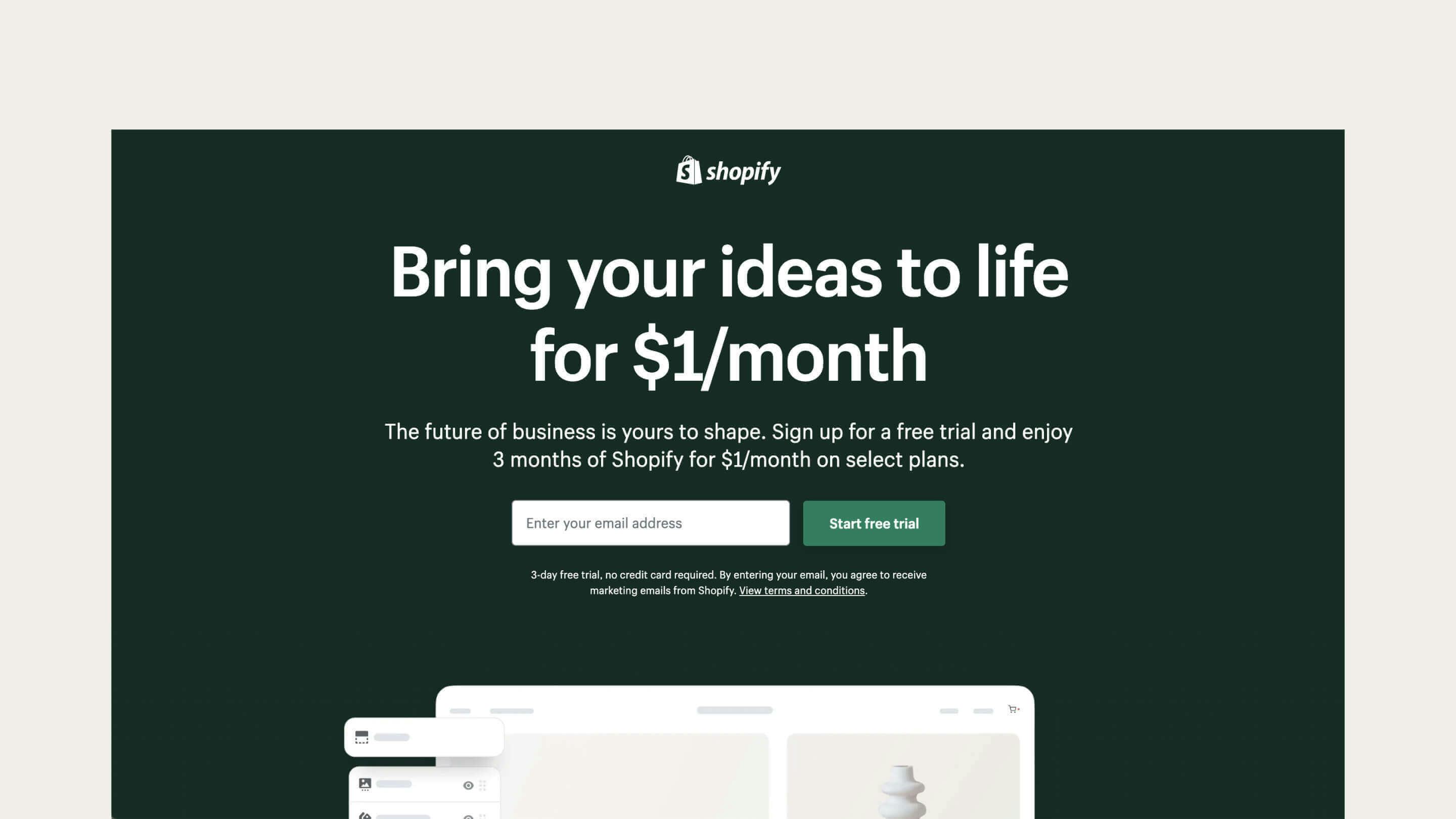
The call to action on the Shopify home page focuses on the benefit of the action it promotes - signing up for a free Shopify trial.
"Submit" would have been valid, if unexciting, text for this button. "Submit" accurately describes what clicking the button achieves, but the user's primary goal isn't submitting an email address. Submitting an email address is simply a means to an end, that end being the commencement of Shopify's free trial. By focusing on the benefit of signing up, they have created a much more compelling call to action.
Remain platform agnostic
A less obvious benefit of focusing on the end goal over generic actions such as 'click here' in your CTA text is that the call to action remains relevant no matter the device.
For instance, 'click here' makes as much sense on mobile devices as 'tap here' does on desktops without touch screens. By not focusing on the interaction in your CTA, you avoid any potential confusion caused by device-specific language.
Make the benefit obvious
Even if the benefit isn’t as obvious as a free trial, your CTA should still offer something of value.
Newsletters are an excellent case in point. "Subscribe to my newsletter" is hardly compelling when your inbox is likely already bursting at the seams. So use your CTA to focus on selling what your newsletter provides and make it exciting. For example, if you run a cooking website, "Get daily recipes" is a far more intriguing proposition than "Subscribe".
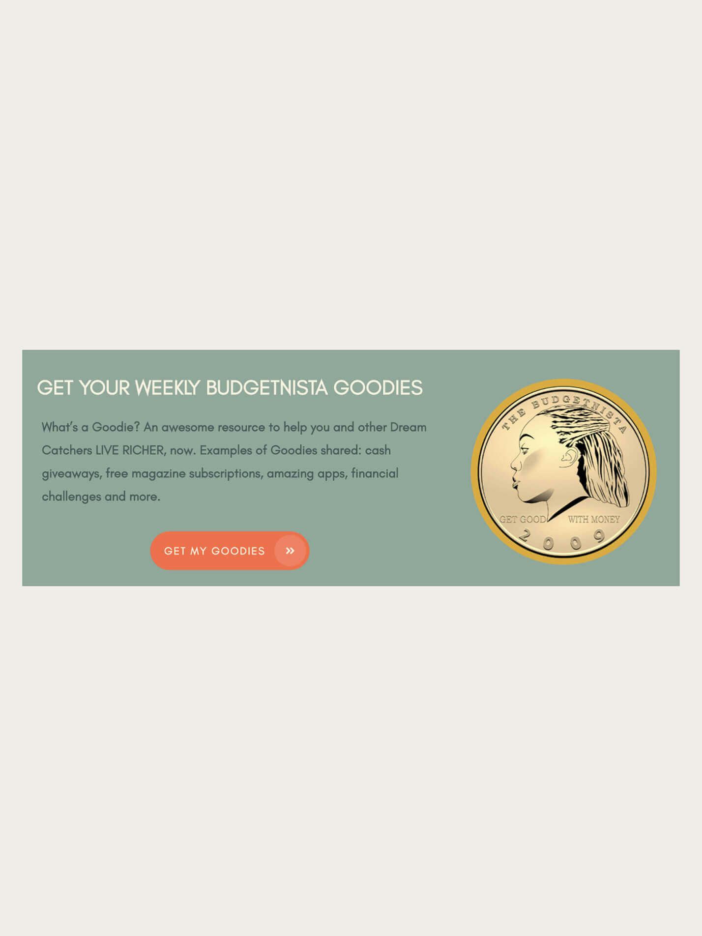
You can even get a little playful if you wish. Financial advisor Tiffany Aliche uses "Get my goodies" as her newsletter CTA. While the CTA relies on users reading the supporting text to understand what’s meant by ‘goodies’, it’s a fun and engaging prompt to sign up to her email list.
You can still use exciting language even if your CTA isn't pushing for a direct conversion. Apple knows the value of a good phone camera and uses emotive, compelling language to tempt you to learn more.
Whatever approach you take, be sure your CTA language can be easily understood and doesn't promise anything you don't plan to deliver.

Keep calls to action short and punchy
It’s easy to fall into the trap of writing overly long call to action copy. Calls to action are at their best when they are simple, easy to understand and stand out on the page.
While the CTA should focus on the end benefit of the action in question, it does not have to be a comprehensive description of what is on offer. It’s acceptable, even desirable, to support your CTA with descriptive copy if required. In the Budgetnista example, you can see how Tiffany used additional copy to explain the 'goodies' she’s promising.
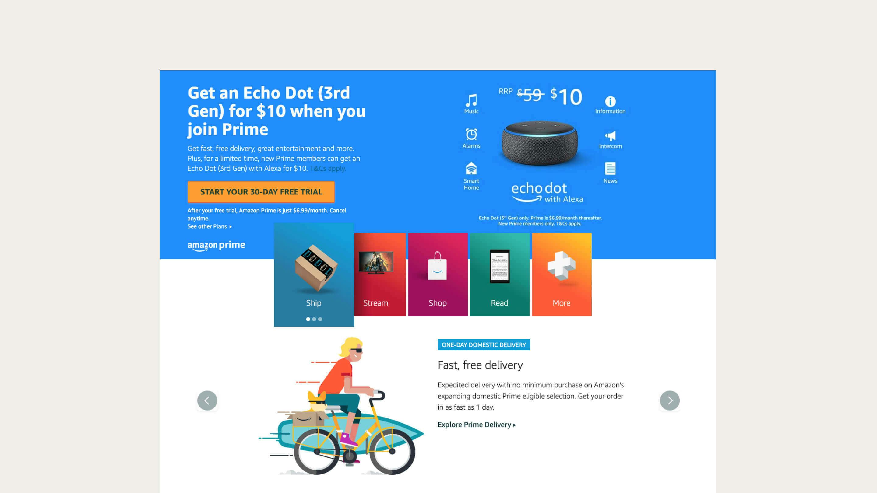
Think of CTA copy as the pointy end of the offer rather than its entirety. Amazon's Prime service has far too many benefits to fit into a single button. Instead, Amazon's approach is to focus on the free trial in the CTA and support that offer, with service benefits listed in the surrounding copy.
Make your CTA stand out
A good CTA button makes it clear what action the user should take. Users are frequently time-poor, and the more effort they have to expend to work out what they need to do to take advantage of your offer, the less likely they are to take action.
Place your CTA button in a prominent space that won't compete with other site elements.
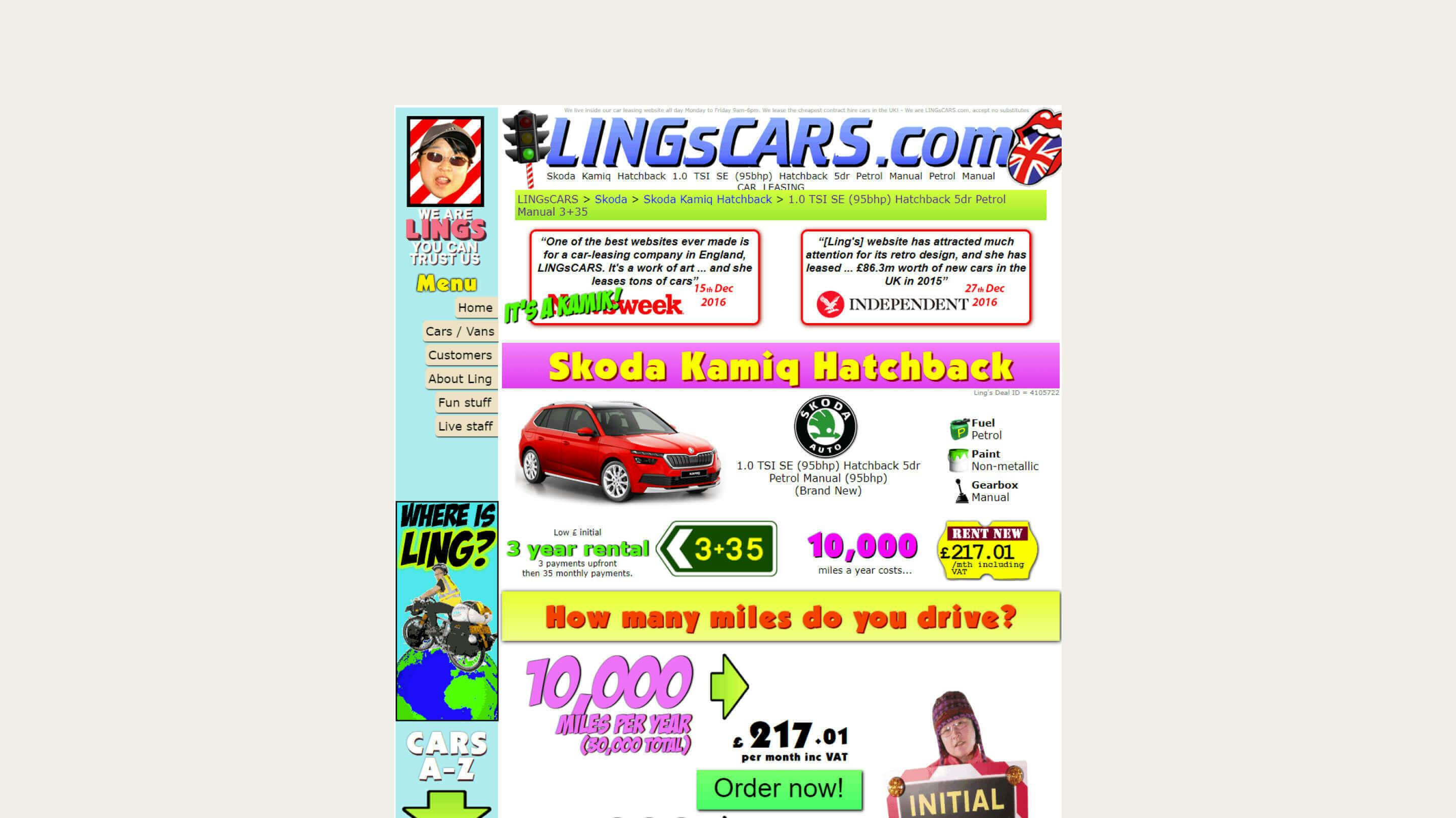
Ling's Car Rentals trades heavily on having one of the web's most intense site designs. While this geo-cities era design is all part of the joke, it remains an excellent example of what not to do with web design. The green "Order now" button in the shot above is the primary CTA, but the myriad of other high-contrast elements on the page prevent it from standing out.
Stick with convention
Don't get too clever with your button design. Users expect buttons to look a certain way, and deviating too far from this design means you have to work harder to let the user know how to interact with it.
A good CTA button typically follows these elements:
- Broadly rectangular/pill shape
- Uses a strong colour contrast to stand out
- Takes advantage of white space
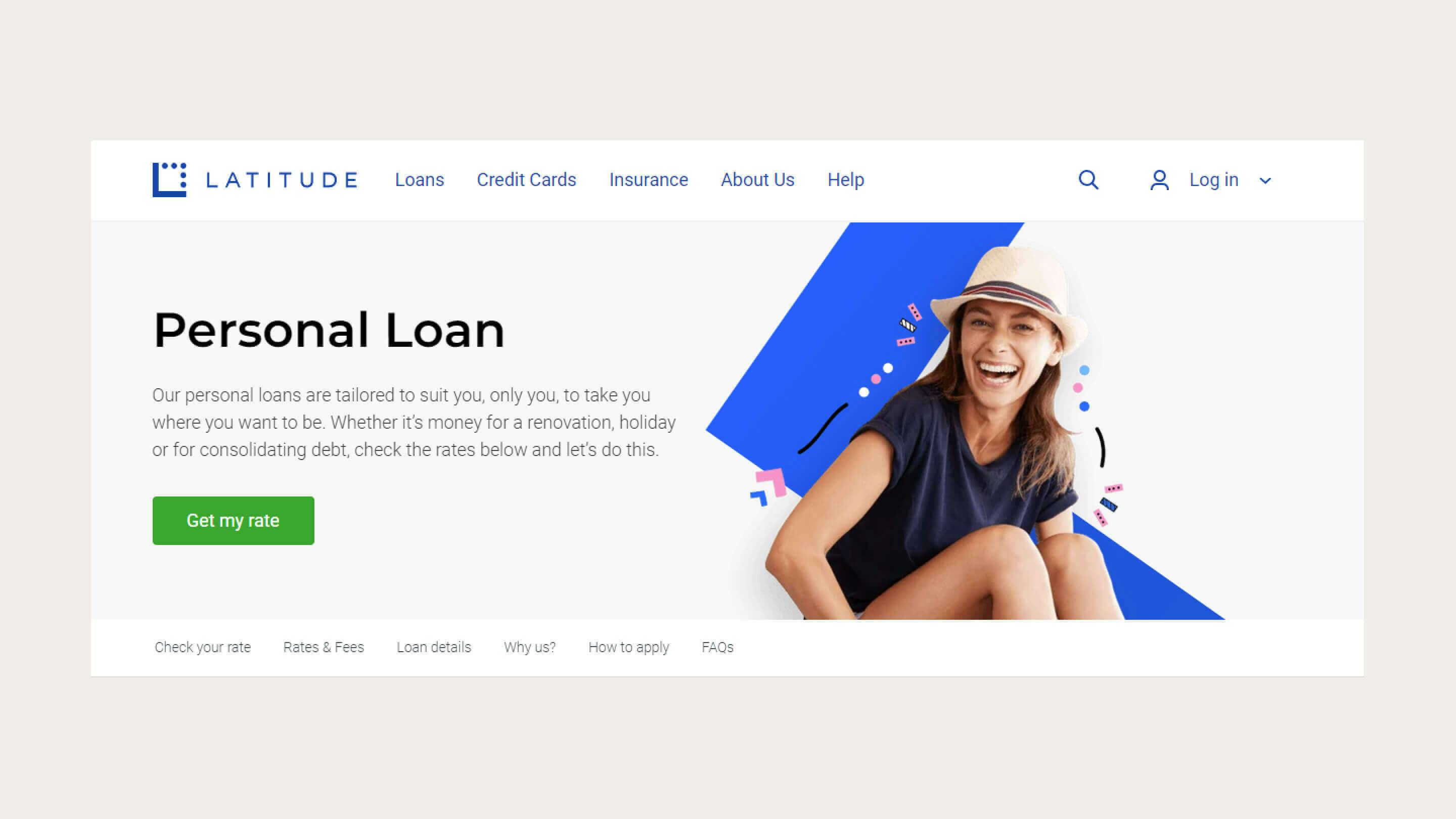
Latitude Financial's personal loan landing page may not be a particularly inspiring design, but you can see how their no-nonsense CTA button makes it very clear what the user's next step should be.
Establish the primary CTA
There may be times when you have multiple, closely related CTAs. In these situations, it is critical to guide the user by establishing which call to action is the main one.
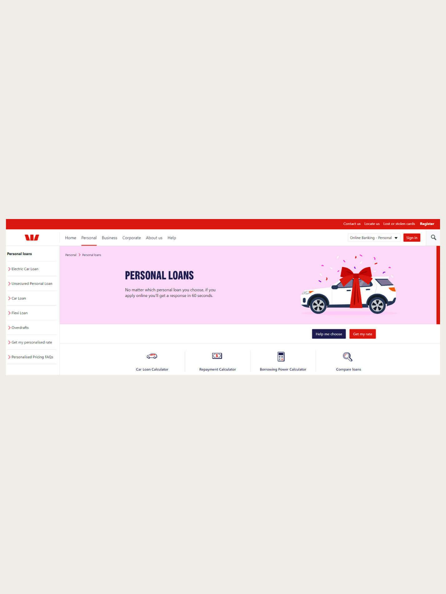
The below page from Westpac features two call to action buttons, but it’s challenging to determine which one you should click.
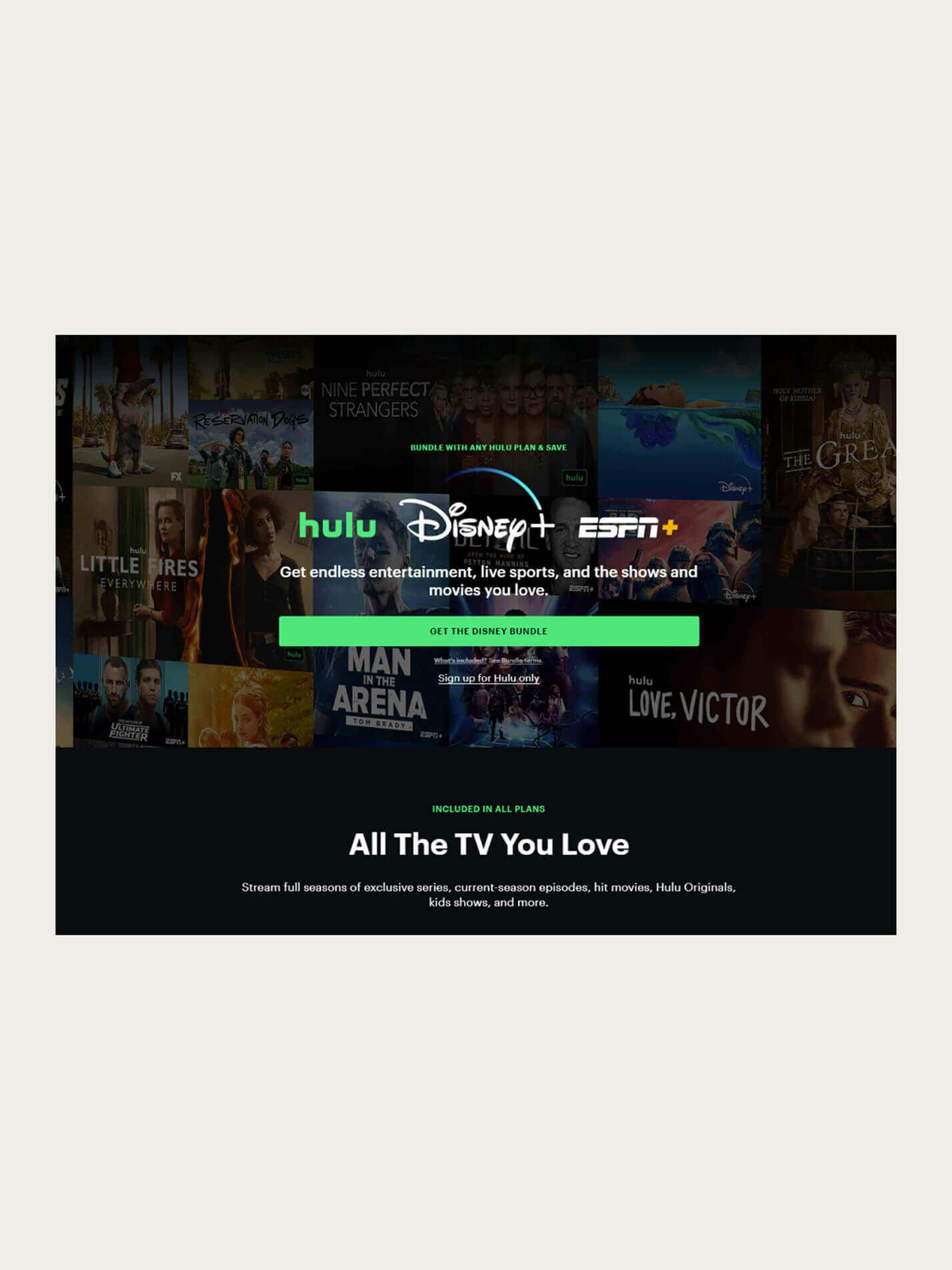
Hulu, on the other hand, also has two calls to action. But where Westpac didn't assign a primary CTA, Hulu took their secondary CTA (signup for Hulu only) and made it a text link. This approach focuses the user's attention on the primary offer (the Hulu and Disney+ bundle) while still offering the other option.
If you have multiple related CTAs, you don't necessarily have to go as extreme as Hulu has; ghost buttons (where the button is just an outline with no solid fill) make for excellent secondary CTA designs. Just be sure you always pair ghost buttons with a more traditional solid-filled primary button design, or you risk the element looking more like an input field than a button.
Design your CTAs for accessibility
Most of the CTA recommendations in this article contribute to accessibility:
- Descriptive text helps screen reader users more easily understand the CTA's purpose without visual queues.
- Short, simple CTA text maximises the number of people who will understand the CTA no matter their literacy levels.
- CTAs that stand out visually are more easily discernible by people with vision difficulties.
Beyond those points, there are two other areas where you can ensure your CTA is accessible.
Text contrast
We've already established that your CTA must contrast with the surrounding content. Still, it is equally important that your CTA text contrasts strongly against its background (i.e. the button design).
High contrast between foreground and background is one of the simplest ways to ensure everyone can read your CTA text. You can test if you have enough colour contrast with free web tools such as the Color Contrast Accessibility Validator.
Keyboard accessibility
Most desktop users may make use of a mouse to navigate your web content, but to assume everyone does so would be a mistake. Many web users (particularly those reliant on assistive technologies) use a keyboard or other device. If you can't navigate to your CTA with a keyboard alone, then chances are a lot of people with disabilities are going to struggle as well. Ensure your page design supports keyboard navigation and your CTAs can be accessed that way.
Test frequently, test often
The above advice is helpful to get you started on your CTA journey, but nothing beats empirical evidence when developing the best CTAs for your site.
Use website testing tools to test different variations of your CTAs against your actual website visitors to determine what works best. There are many elements which can impact the success of your CTAs, so test them all. Some ideas to try:
- Copy
- Button colour
- Button size
- Button position on the page
- Button design
- Supporting text
When starting your testing, focus on significant changes. Testing variants that differ significantly will typically reach statistical significance faster than test variants with more subtle changes.
For example, changing the verb form of your CTA from 'click here' to 'tap here' is unlikely to have a big impact. Making your button stand out more through colour choice or changing from a 'click here' style CTA to something that more directly references the benefits of the intended action will have a far bigger impact.
Once you have a general idea of the type of CTA that works best for you, turn your focus to incremental changes to polish and tweak your design into a winner. You can read more about the importance of testing in our recent blog on A/B and multivariate testing.
Conclusion
A powerful CTA can be the difference between a page that converts visitors and one that sends them to your competitor’s website.
Your visitors come to your website with a goal in mind. A well-considered CTA that aligns with this goal is like a giant signpost guiding them along their path.
When developing your web pages, consider what your visitors are trying to achieve on that page. A prominent CTA may not always be appropriate, but when there is an obvious and important step for the user to take that will meet both their goals and yours, a solid call to action can benefit both parties. The critical thing is to make sure that call to action does the work it needs to.
If you need help working on your calls to action or any other area of your website to improve overall performance, speak to Tundra today.
Let's work together
Get in touch